designed with a collective India in mind
But with a past that isn’t cast(e) aside
-
Udhbav Bharadwaj (Team Lead)
Ritwiz Sharma (CGI Execution with my Creative & Art Direction)
Shubham Mogdi
Aaditya Mehra -
As Lead Designer, I took on the responsibility of guiding the overall creative direction of the chess set project. My role was to set the tone—defining key design principles and ensuring the final outcome reflected both the intended theme and a cohesive aesthetic. I worked closely with my design team members, offering feedback, support, and mentorship throughout the process, while also collaborating with Young Designers India to keep the project aligned on timeline, quality, and deliverables.
Beyond shaping the creative vision, I facilitated design reviews and kept communication open across the team. My goal was to ensure that everyone stayed true to the shared design guidelines while still having the freedom to express their individual creativity. I focused on creating an environment where designers felt supported and inspired to bring their best ideas forward. The result was a chess set that felt unified as a whole, yet allowed each piece to stand as a distinct expression of design.
-
Team Leader
Creative Direction
Art Direction
Story and Background
Final CAD
Final Presentation
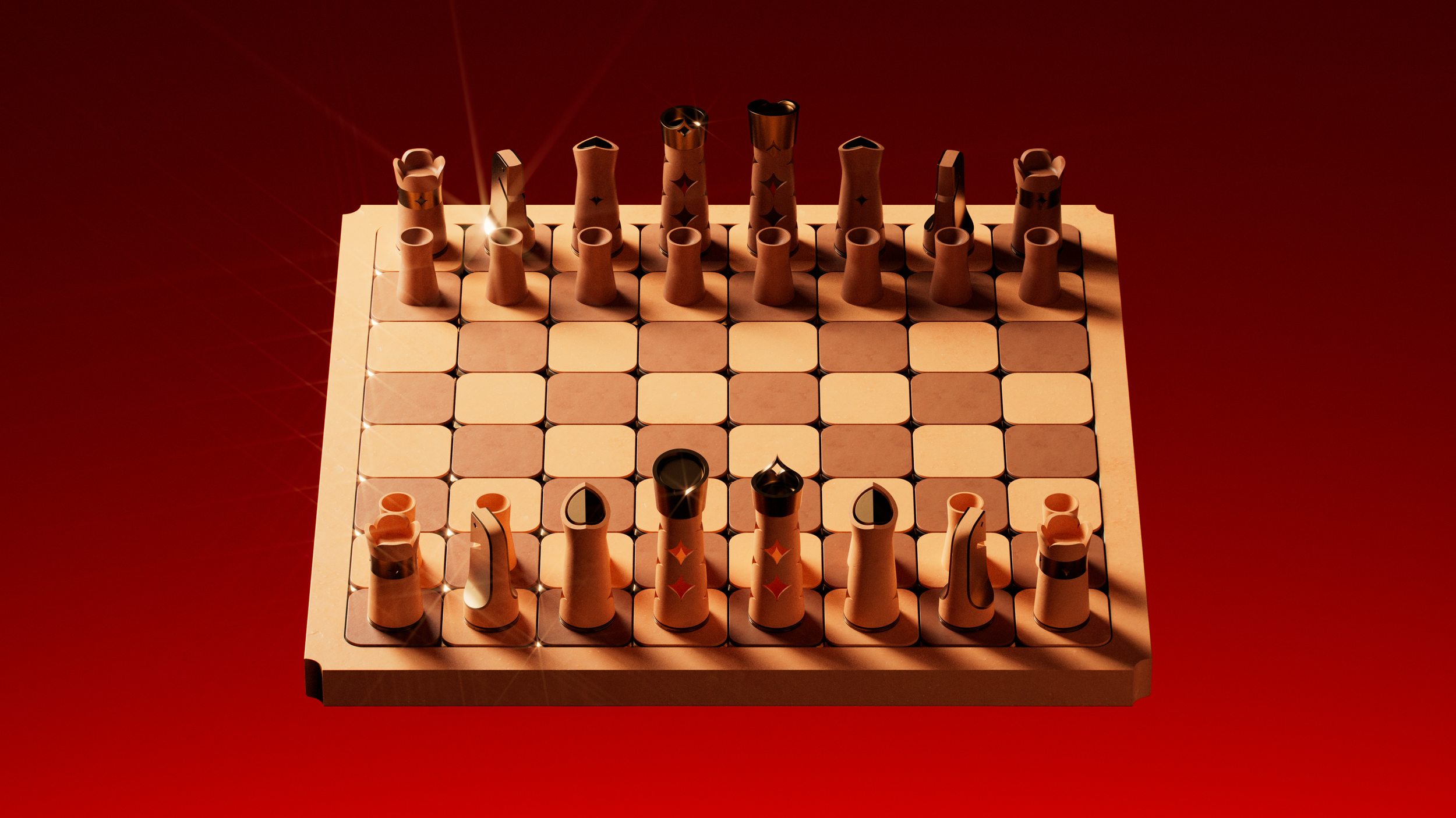
To design a chess set that captures what a modern India represents—without casting aside the subcontinent’s millennia of history—was the central challenge of this project. As the lead designer, I set out to guide my team members through a deep exploration of India’s cultural, material, and visual landscape. No stone was left unturned when it came to inspiration. We drew from the interplay of light and shadow, materials ranging from marble to terracotta, and forms that range from the geometric precision of temple carvings to the fluid elegance of everyday objects.
Quietly informing this project was a reflection of the structures of class and hierarchy that have long shaped Indian society, systems that are not only embedded in our cultural history but also in the very framework of the game of chess. These ideas weren’t foregrounded, but they added depth to the narrative, guiding how we thought about symbolism, power, and identity across the set. Each reference was considered not as surface details, but as story—embedded into the structure, symbolism, and functionality of each piece, the board, and the packaging experience.
This project was supported by Young Designers India, in partnership with TEAGUE and Figma. It offered a unique opportunity—not only to share my experience with an ever-growing community of emerging indian designers, but equally to deepen my skills. It allowed me to step into a leadership role, guiding a team while sharpening my approach to art direction and creative direction in a real-world, collaborative setting.

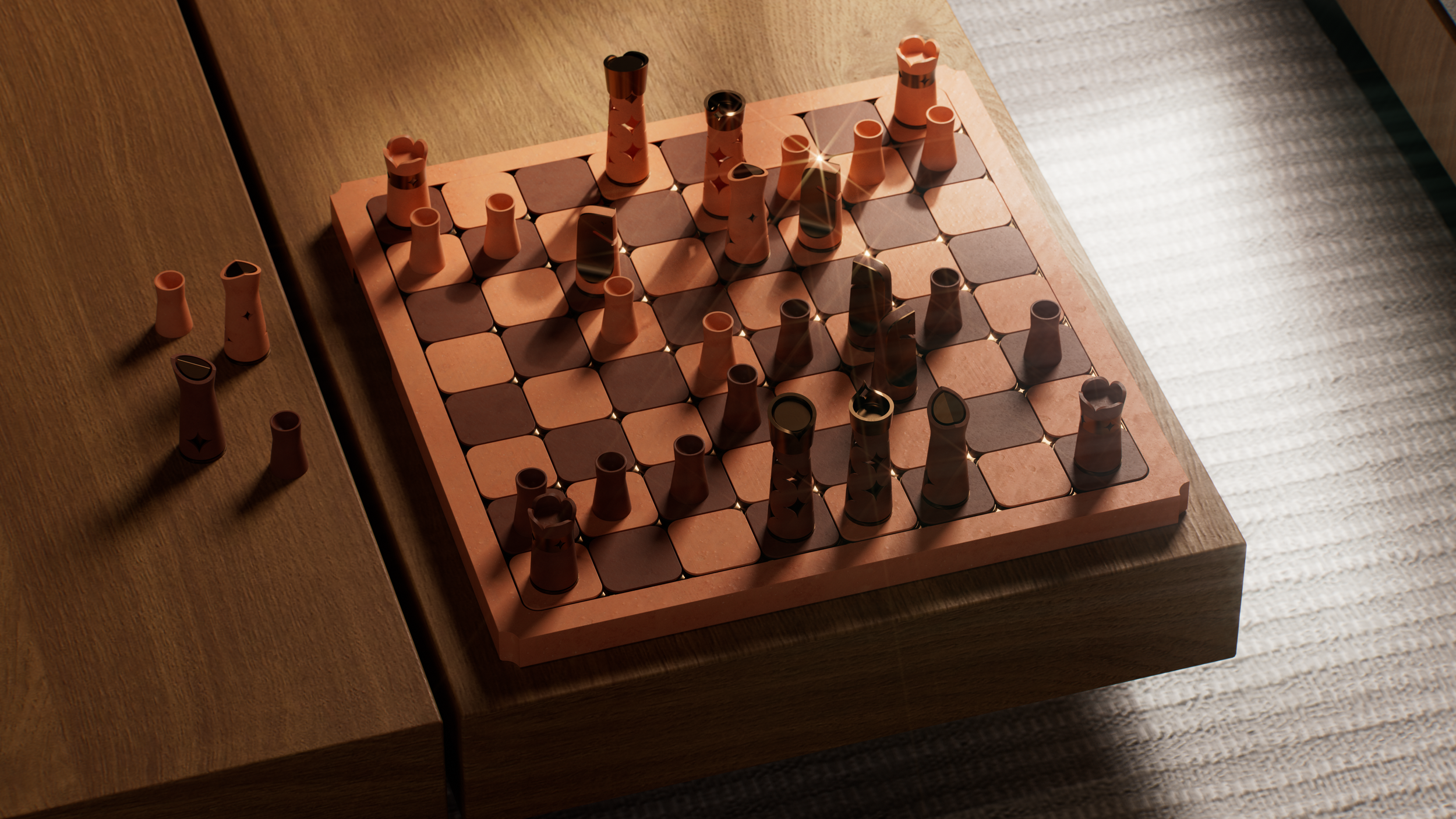
pieces

board

packaging
(full process video in final stages)

bits of Creative direction
Grounding through materials
We wanted to explore what it means to create with intention, starting with the materials themselves. Natural materials like terracotta and bronze felt honest, grounded, and deeply connected to India’s cultural fabric. We weren’t just drawn to their textures or weight, but to the stories they carried, and how they could be reinterpreted in a form as universal as chess.
We aimed to create a set that felt both timeless and contemporary, something that honoured tradition without feeling stuck in it. The process became about finding balance: between craft and concept, history and modernity. Through this, we hoped to build a chess set that didn’t just look Indian, but felt Indian in its material, its making, and its meaning.

Terracotta Shades
India’s soil shifts in color and texture across its geography, shaping the nature of its terracotta. In the south—Tamil Nadu, Karnataka, and Kerala—the clay is rich in iron and turns a deep red or burnt orange when fired, reflecting the heat and mineral weight of the Deccan plateau. Moving east toward Odisha and West Bengal, the lateritic soil becomes heavier and deeper in tone, firing into earthy browns and muted reds. The Gangetic plain carries pale, silty river clay that dries light grey and fires into a soft tan or dusty peach. In the northeast, across the Seven Sisters, the clay is darker and cooler, often brown or ash-grey due to rich forest loam and volcanic traces.
Diversity in soil mirrors the diversity of the people of india

soldier
The soldier represents potential—it starts small, slow, and vulnerable, but with the right moves, it can become the most powerful piece on the board. Like the seeker on the path of dharma, its true strength is revealed only through perseverance and transformation.
design notes
To keep the soldier recognisable, we decided to invert the concept of the spherical head. That space creates a cavity that will be taken advantage of when the soldier completes its journey across the battlefield


CHARIOT
The Chariot represents grounded strength—it begins at the corner, quiet and unmoved, yet its path cuts across the board with clarity and resolve. A symbol of unshakable presence, memory, and deliberate force. It does not rush—it advances. Where others seek agility or cunning, the Chariot relies on its patience. It is both fortress and force, a reminder that stability can be power.

design notes
Its top is carved with four controlled cuts—curves that rise and fall in rhythm, forming an undulating surface that holds motion in tension. Beneath, a hollowed cavity reveals a smooth, rounded floor—a quiet homage to the vimanas of the Ramayana.
The outer body is wrapped by a bold bronze ring, a gesture of strength and continuity. Cut into it are four star forms, rotated 45 degrees from the top cuts. They do not face the directions the piece moves, but rather look outward, like the sensors or eyes of the chariot. This offset alignment creates a subtle dissonance—a readiness, a held energy akin to a wheel just before it turns.


knight
The Knight represents swift intuition. It does not move in straight lines, but arcs through space with precision—restless, alert, and always in between. Where others charge head-on, the Horse shifts sideways, sensing openings before they appear, and acting in the instant between thought and motion.

design notes
This piece marries terracotta and bronze in a form both ancient and modern. The body is a single, monolithic cylinder of terracotta—its silhouette carefully cut to suggest the profile of a horse, subtle yet unmistakable. Flanking this warm, earthen core are two bronze plates, each cast using the traditional lost-wax method. At the eye, a four-cornered star is embossed into the bronze—an intentional gesture, designed to hold your gaze and anchor the piece in symbolism and clarity.
We sought a delicate balance between recognizability and originality: a form that speaks of horse and armour, yet avoids cliché. The knight is tactile, graspable, and inviting. It is designed not just to be seen, but to be held.


Elephant
The Elephant represents measured presence. It does not rush forward, but watches from the periphery—anchored, aware, and always aligned. Where others react, the Elephant waits, sensing the rhythm beneath the surface before it moves.

design notes
This is not just a reinterpretation of the bishop. It is a return. A return to what the piece once was, before Western standardisation shaped it into a form disconnected from its roots. In the Indian tradition of chaturanga, this piece was an elephant—a figure of strength, foresight, and deliberate motion. This journey brought us to the Mishra Yantra, an ancient astronomical instrument used to track celestial time. It gave us more than geometry—it gave us a way of thinking. One rooted in rhythm, alignment, and layered observation.
The bronze core, dense and elemental, sits at the heart like the fixed gnomon of a sundial—measuring, anchoring, remembering. Around it, a terracotta shell—poured, shaped, and aged by the hand—forms a body that is tactile and alive, always carrying the potential to crack, breathe, or bear marks of time. It speaks to a core of permanence surrounded by impermanence.
This is not an elephant as seen in profile. This is the elephant as presence felt across the board, grounded in rhythm, and moved only when the moment calls.


The queen’s tiara holds a subtle cavity—an absence shaped with intention. It mirrors, in exact form, the crown jewel set at the front of the king’s headpiece. This shared geometry isn't ornamental; it’s symbolic. One holds presence, the other, potential. It speaks to the interdependence of power—the idea that sovereignty isn’t singular but shared, that leadership in this system is not about dominance, but balance. In designing the queen, we weren’t interested in simply scaling or feminizing the king. Instead, we created a counterpart whose strength is defined not by mimicry, but by a deliberate resonance. Where the king carries the jewel, the queen carries the space that gives it meaning.
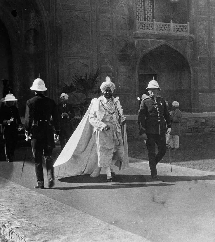
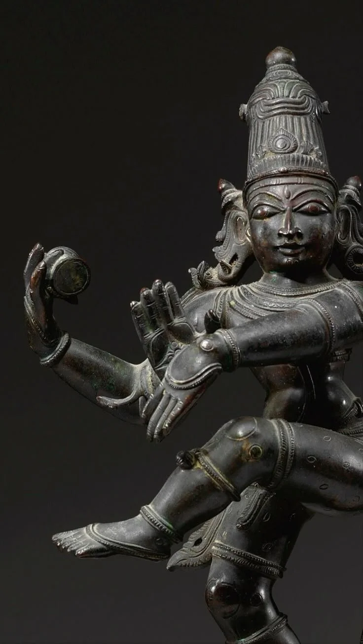
For the king, we deliberately moved away from the conventional European crown and instead drew inspiration from the headpieces worn by Indian rulers—particularly the turbans and sarpech of Mughal emperors, Punjabi maharajas, and Sikh leaders. These weren’t just ornamental—they were deeply symbolic of earned power, lineage, and responsibility. Where a Western crown is often about divine right and inherited rule, the Indian turban is tied, not placed. It signifies a role accepted with weight, not just granted by birth. From a form perspective, these headpieces gave us a layered structure to work with—radial curves, central spines, and vertical lift that could be abstracted into a silhouette both regal and culturally grounded. It allowed us to craft a king that feels local in its authority—one that reflects power not through height or symmetry, but through presence, lineage, and quiet command.


but when the soldier completes its journey?
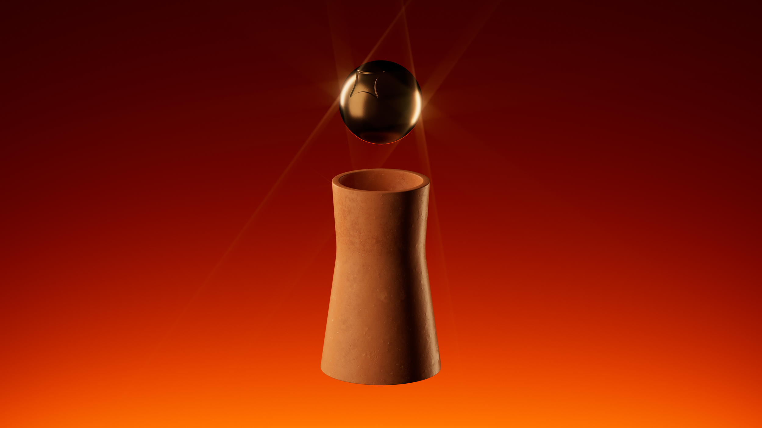
The pawn’s negative space was deliberately shaped to accommodate a symbolic transformation upon promotion. Rather than requiring a separate piece, a single jewel-like sphere can be placed atop the pawn once it crosses the board, embodying its evolution, crowning its achievement. While this typically signifies promotion to a Queen, the system allows for flexibility, acknowledging scenarios where another piece may be needed.
The sphere itself features the same star motif found across the set. When placed with the star facing upward, it signifies a Queen. If another role is assumed, the sphere can be inverted to conceal the symbol, maintaining visual coherence while subtly signalling the change.

bronze elements
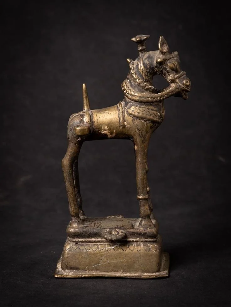
Bronze held a foundational place in Indian material culture, valued for its strength, malleability, and ceremonial luster. In ancient warfare and mobility, horses were adorned with bronze accessories—bits, bridles, and ornamental fittings—crafted for both function and status, often engraved or cast with regional motifs.
Bronze coins, depending on the era and dynasty, were either struck using simple stamping techniques or intricately shaped through the lost wax method, especially in the post-Mauryan period.
Across regions, bronze was the preferred alloy for daggers, swords, and even elements of armor, prized during the Bronze Age for its resistance to corrosion and ability to hold a sharpened edge without brittleness.
In the South, particularly in Tamil Nadu, bronze became the sacred metal of divine form—idols and temple lamps were, and still are, cast using the lost wax method, a process chosen not only for its detail but for the way bronze captures gesture and grace in a way few other metals can.

design notes
As part of the overall design, bronze is not only embedded in the materiality of each piece (except the pawn), but also used to create engraved bases that quietly indicate the direction of movement unique to each piece, merging function with symbolism in a tactile, enduring form.

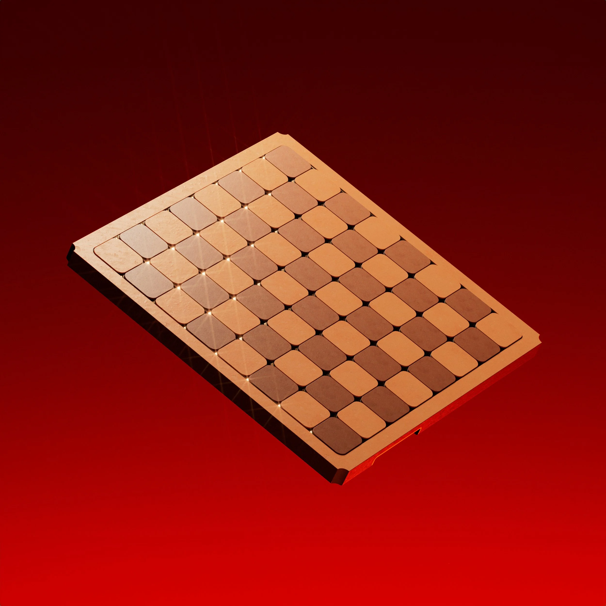
the board
Mirroring the CMF of the chess pieces and its consistent motifs, the chess board resonates and oozes Indian history in a multitude of ways. It carries the same light-and-dark pattern expected of a chess board, while both blending in and standing out. The slightly raised playing surface mimics the architectural rhythm of stepwells, while its flat borders recall the quiet restraint of stone courtyards—framing the game without distraction. In the cavities of the rounded square spaces lies a sunken bronze star that provides depth on many levels—visual, symbolic, and tactile. Designed to shift with light, it changes its aesthetic under different lighting conditions and glistens effortlessly in sunlight.
design notes
The board features 49 full stars, evoking the spiritual completeness of 7 cycles of 7, and 28 half-stars, subtly nodding to the 28-day lunar cycle and the rhythm of time as understood in Indian tradition. Together, they form a quiet grid of cosmic order—rooted in astrology, philosophy, and ritual symmetry.

CMF
Carved from a singular slab of terracotta, the board adheres to official chess dimensions while anchoring itself in material authenticity. 64 tiles, individually set with precision grout lines, form the checkered battlefield—each cavity housing a carefully embedded bronze star that lends both depth and ritual symbolism. To preserve the board’s minimal silhouette, the carry solution was quietly resolved through two offset handles, positioned on opposite sides to distribute weight and offer intuitive grip without disrupting the visual balance.

design notes
The board features 49 full stars, evoking the spiritual completeness of 7 cycles of 7, and 28 half-stars, subtly nodding to the 28-day lunar cycle and the rhythm of time as understood in Indian tradition. Together, they form a quiet grid of cosmic order—rooted in astrology, philosophy, and ritual symmetry.

packaging experience
In Indian culture, gift-giving is inseparable from moments of celebration—an expression of care, joy, and shared tradition. We designed this box to echo the feeling of receiving a box of sweets: familiar, festive, and full of delight. It’s a gesture meant to spark the same warmth, laughter, and anticipation that fills the air during the festive season.

design notes
The unboxing begins with a deep peacock blue—rich, regal, and unmistakably Indian. As the sides lift away, a thick sheet reveals itself, emblazoned with a single bronze star. Cutouts scattered across its surface align perfectly with the star motifs on the board below, creating a layered, jali-like experience that plays with light and shadow.
Beneath this sheet lies the chessboard, catching the light as it’s unveiled, its surface glimmering within a precisely cut wooden frame that offers both protection and quiet ceremony. Under the board, a muted, oversized pattern hints at a deeper reveal—an invitation to keep exploring.
Finally, the pieces appear, resting on an angled platform that faces the players. They're easy to lift, ready to be placed into play, arranged to maintain the ritual of the game while enhancing its tactility and joy.
